

Products and services


Regression to the mean is a powerful and common source of bias in interpreting data. Once understood, its potential to mislead is obvious. Yet many scientists are regularly fooled by it. In this blog I shall try explain it.
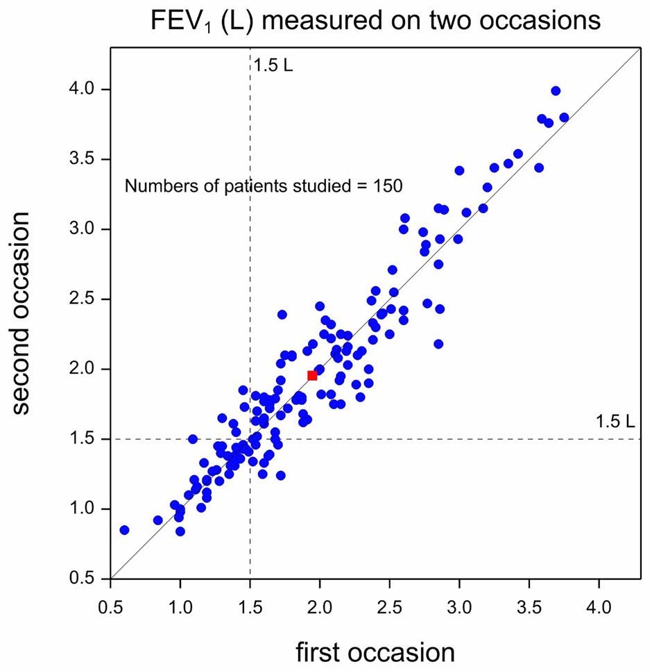
Figure 1 is a so-called scatterplot presenting data from a cross-over trial in asthma that I helped design many years ago and shows values of forced expiratory volume in one second (FEV1) measured on two occasions. A cross-over trial is one in which patients are given different treatments on separate occasions. However, here the measurements represented were taken on each of the two occasions before the treatments was administered: they are so-called baseline measurements. The units of measurement are litres (L) and FEV1 is a measure of lung function, with higher values indicating better lung function. Since, as already explained, on both occasions the measurement were taken before administration of treatment, they may be taken to represent the natural untreated state of the patients studied. Each blue circle represents one of 150 patients and plots FEV1 on the second occasion (the vertical dimension) against FEV1 on the first occasion (the horizontal dimension). The red square represents the position of the ‘average’ patient. Two dashed lines are plotted at 1.5 L, one vertical and one horizontal. These are supposed to indicate a boundary between extremely poor values (less than 1.5L) and other (less poor) values for period 1 and period 2.
A solid diagonal line rising from bottom left to top right is the line of equality. If a blue dot lies on this line, the patient had the same reading on the second occasion as on the first. If the blue dot lies to the left and above this line, the reading was higher on the second occasion than on the first and if a dot lies to the right and below the line the reading was lower on the second occasion. Note that the red square lies almost exactly on the line, indicating that on average patients were no better on the second occasion than on the first and this merely reflects the fact that the blue dots are scattered on either side of the line of equality, with no obvious tendency to lie on one side or the other. Of course, there is a general pattern to the observations that reflects what statistician call a positive correlation. If a patient’s values were high in the first period, they will tend to be high in the second period but the relationship is far from perfect. In fact, the points tend to cluster around the line of equality reflecting not only that there is correlation but that the distribution is similar in the second period to the first.
As regards trends over time, however, the message seems clear: there is no obvious systematic ( as opposed to purely random) difference for values in the second period compared to the first. However, if we select particular values for examination, we must be very careful not to fool ourselves, as I shall now explain.
Figure 2 represents what we would see if we only decided to retain for treatment on a second occasion those patients whose first period values were extremely poor, that is to say less than 1.5 L. Of course, all 150 patients would have been measured on the first occasion but as it turns out, only 43 patients had values less than 1.5 L and so it is only for these patients that we would have values from the second period. The 43 pairs of values that would result are shown in the scatterplot.
The remaining unselected patients which, taking 43 from 150, are 107 in number, are represented by unfilled circles. Since, for these patients the second period values are not available, the first period values have been plotted against the horizontal axis. Also shown is the mean value for all 150 patients on both occasions represented by a red square. Of course, we do not have the mean for all 150 on the second occasion but as we saw from Figure 1, the mean of all 150 on the first occasion provided a very good estimate of the mean on the second.
If we now look at Figure 2, we can see the following. All 43 patients were classed as having FEV1 values that were extremely poor in the first period. However, six of them now have values that are no longer extremely poor, being equal to or above 1.5L. There were, however, no patients who moved from having values equal to or above 1.5L to having values below. Thus, taken as a whole, there seems to be some improvement over time.
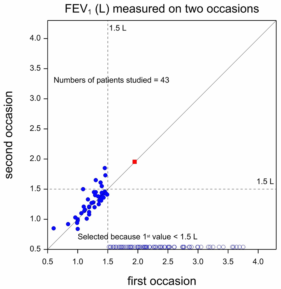
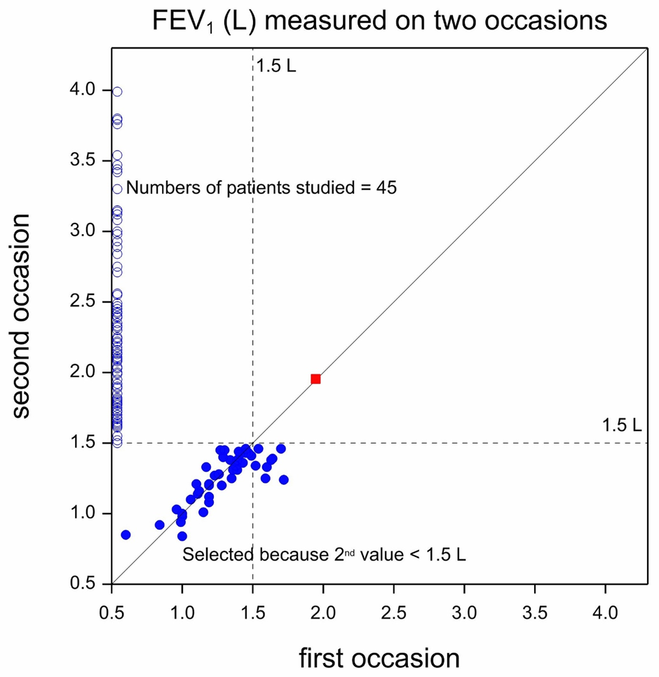
A little thought, however, shows that the reason that this is so is that we collected the data in a way that made deterioration in this manner impossible. All patients with values above 1.5L were excluded by design. Had we had a time machine we could have decided to use the values that patients would have on the second occasion to only retain those whose second occasion values were extremely poor. In that case we would have seen the situation in Figure 3. This shows the reverse position to Figure 2. The patients who were only measured once, but this time in period 2 but not in period 1 (thanks to our time machine!), are again represented using open circles but now plotted against the vertical axis. There are now 8 points (two are difficult to count separately because almost identical) where patients had second period values that were below 1.5L but their first period values were not. We now have 8 patients who moved from having not so poor values to having extremely poor ones and none who moved the other way. Again, however, this fact is of no scientific relevance. It merely reflects the way the data have been cut.
Regression to the mean is a powerful potential source of bias. If units are selected for further study because their values were extreme when first measured, on average they will be less extreme when measured again. They may be expected to be somewhere between the original values and the overall mean of all (selected and unselected values). They have thus regressed to the mean. We typically do require that patients who enter a clinical trial have extreme values. For example when recruiting patients for a clinical trial in hypertension, we might require that they demonstrate a diastolic blood pressure (DBP) when measured that is at least 95 mmHg and reject those with lower values. If that is so, we can expect to see a spontaneous improvement thanks to regression to the mean.
How do we deal with this? By having a control group. If we select patients for a clinical trial based on their baseline reading but then randomly allocate them either to receive the intervention or a control treatment, then the regression to the mean effect should (apart from chance) be similar in the two groups. However, to eliminate the regression to the mean bias does require that we judge the effect of treatment by comparing the results at the end of the trial between the two groups and not by comparing the end result to the baseline.
The discovery of regression to the mean as a statistical phenomenon was due to the Victorian scientist Francis Galton (1822-1911). The story of how he came across it is treated in my book Dicing with Death

Title: Dicing with Death
Author: Stephen Senn
ISBN: 9781108999861
Stephen Senn has worked as a statistician and as an academic in Switzerland, Scotland, England and Luxembourg. He is the author of Statistical Issues in Drug Development (1997, 200...
View profile >Keep up with the latest from Cambridge University Press on our social media accounts.


Latest Comments
Have your say!